


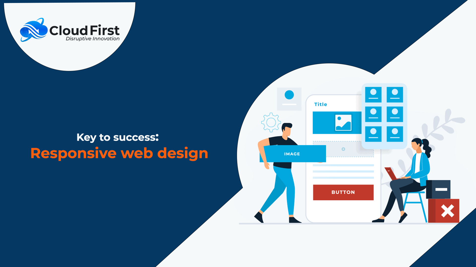
Key to success: Responsive web design
In today’s digital era, responsive web design is not only an option but also a necessity. We can take the example of a shrunken version of a desktop image on a mobile phone. The user will get irritated and will never visit the website again. In this situation, one responsive website design plays a vital role in bringing more audience to your site. As the searches come from different devices, your website should run well on all the devices. It should make sure that the user does not need any zooming or resizing or scrolling to get a better view of the website.
You can also improve your SEO efforts to a great extent with the help of a responsive website.
A responsive website offers many advantages. Let’s dive into that.
Below are the benefits of a responsive website:
Improve user experience
Approaching content that is properly adapted to any device significantly revamps the user experience. A good responsive design also improves readability also increases user engagement; in the case of e-commerce, it improves sales. In general, we can say both the design and its objectives have a better impact, on the business, and the user.
Increase sales & conversions
Responsive sites improve visibility & help in digital marketing as well. This is the goal of any company. A compatible look & feel along with an improved site experience has a positive effect on generating leads and conversions. Google algorithms also focus on responsiveness to a site’s ranking. A mobile-friendly website can improve search engine rankings, thus attracting many visitors who stay around for long. More audience means more engagement and increased search for the service or product. In 2022 there are a greater number of people are using smartphones and tablets. So, designing your website with a mobile-first strategy can reach a wider audience. So, in this way, we can increase leads & keep conversion rates high.
As a professional web development company, Cloud First can help you build responsive web designs that make it easy for Google to crawl your site.
Faster Loading
Responsive web design revamp site loading speed on different devices. A better loading speed not only improves the user experience but also impacts the enhancements of web positioning.
Consolidate your analytics & reporting
A single responsive website means that you no longer have to track conversion paths, user journeys, funnels, and redirections between your sites. Web analytics tools like Google Analytics are now optimized to handle multiple devices & responsive reporting. All your tracking and analytics will continue to function and be maintained in a single report, allowing for easier monitoring and analysis.
Easy to maintain
Having two separate desktop and mobile versions of your website means that you need to have two separate SEO strategies. But with responsive web design, you’ve got only one website that needs to be updated. Simply, put, managing one resource will take less time and cost less also. Apart from that, you can also easily & quickly make any changes to the website through multiple devices.
Nowadays this is a hot topic in the market. Making a website 100% responsive is not a big deal now. If you are already having a website and you want to make it 100% responsive, then you can take assistance from our highly experienced team.
Conclusion
At Cloud First, we feel that having a responsive website for your business is necessary, but that, you shouldn’t overpay.
Cloud-First will provide you with a completely new fully responsive website with no upfront design charges and with incredible features.
Contact us today to get an excellent responsive website for your business